Showing posts with label Roseburg. Show all posts

1.4.14

Current Painting Still at my Easel ... A PEEK AT MY PAINTING IN PROGRESS/Artist Confessions

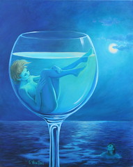
Ruby Red Original, Sold--(Prints Available) Her Popularity Became the Inspiration for a Sequel Artwork

Ruby Red was practically snatched off my easel by a recent client.  The popularity of this painting inspired me to create a sequel painting -- A blonde version with a white wine pour.

THE FACE - A SKETCHY IDEA

INSPIRATION FOR THE WINE POUR:

For the white wine pouring over her head, I chose Chardonnay for its color and also, because I could have a bit of fun with a "word play" on that varietal.  I will call the painting, "Chardonnae".  Usually, a painting title doesn't come to mind until after I create a painting.  I got a wine buzz!

FACE IN THE GOBLET:

For my painting reference photo, I chose a three-quarter facial view of a blonde, instead of a full-frontal view.  This choice differentiates the painting from its predecessor, but not without challenges.  Portraits are the most difficult subject to paint.  Add to that, the fast drying time of acrylics makes blending soft edges more difficult.  Also, acrylics dry noticeably darker than when they were mixed wet.

WHY DO I FREQUENTLY CHOOSE COMPLEX PORTRAIT PAINTING SUBJECTS IN MY WINE-THEMED PAINTINGS?

I'm establishing myself as a contemporary "go to" wine artist who celebrates the wine experience differently than the ordinary wine art genre does.  That involves creating wine art not typically seen.  I haven't seen any women's faces or bodies in wine vessels the way that I render them.  I hope to create sensual, elegant, simplicity in my wine narratives.  Zooming in to intimate views of realistic or abstract  human forms seems to engage viewers (and me) more.  It's a challenge that fascinates me.

BEYOND SKIN DEEP & ONWARD

GOING BEYOND SKIN DEEP:

After rendering her face similar to the reference photo, I realized she needed more dimension than was evident from the photo, especially on the left side.  Without a subtle change in plane from the side to the front of her face, she literally appeared flat.  The photographer used more than one light source to blow out most of the shadows cast by her features.  Fashion photography intentionally avoids light that creates harsh shadows and lines to produce more flattering results.  It was fine for the photo because her hand and her hair defined her well enough.  Isolating her face from the rest of her head and including more of the side of her face with the three-quarter view, as I did in the goblet, created more of a portrait challenge.  While I didn't want harsh shadows and features in my painting, I had to invent a more apparent light source and appropriate shading to define her facial forms.


COLOR CONFUSED/ADJUSTED

CHARDONNAY COLOR CONFUSION:

Considering my passion for wine art scenarios, it may surprise you to learn of my limited wine-tasting experience.  I have never observed or tasted Chardonnay wine.  (I do gravitate to white wines like Reisling and Pinot Gris.)  For the painting wine pour, I googled "What color is Chardonnay?"  I saw two kinds of Chardonnay pictured:  One, pale yellow-green and one described as a golden copper-yellow, or saturated straw gold.

I headed back to my easel with that descriptive vision of coppery-gold in my mind's eye.  Things went well with the painting.  For some darker areas to define the streams of wine pouring, I used a burnt orange.  Unfortunately, the oranges became so rich that the coppery-gold tones were overpowered.  When the painting dried darker, as acrylics do, I had a rusty-orange redhead;  not the sultry blonde I was aiming for.  This would not do -- I had to get it right.  Painting is a constant process of adjusting.  Sometimes you just have to get it wrong before you discover how to get it right.

I revisited the Chardonnay illustrations at my computer.  This time I noticed the color described as a coppery-gold was actually a yellow gold with a greenish cast.  I mixed a more neutralized gold and started painting over the dominating orange tones.  I feel I'm on the right track now.  I'll probably replace the orange in the wine bottle with neutralized green casts.  STAY TUNED FOR THE BIG FINISH IN THE NEXT POST...

http://pixels.com/products/ruby-red-sandi-whetzel-galaxys4-case-cover.html
Smartphone case, click here

 UPCOMING ART EXHIBITS:

If you are local to Roseburg, I invite you to attend an artist reception for myself and two other artists, Susan Rudisill and Andrew Duclos at Fisher's Flowers & Fine Art, 638 W. Harrison St, Roseburg, OR on this Friday, 4/4/2014 from 5:30 - 7:30 p.m.  Fisher's is near the corner of Harvard and Harrison.  The art receptions at Fisher's are popular for their fine art, delicious treats and fine wine tasting.  I have a few large, sensual wine paintings on display at Fisher's from now through June 27, 2014.  I'd enjoy visiting with you in this relaxed, fun venue if you attend the reception this Friday.

Sandi's vibrant, textured floras are hanging at Ticor Title Insurance and next door she has a few wine paintings on display at Fortress Financial, 180 Lithia Way, Ashland, OR through April 2014.  These are new venues for Ashland's First Friday Artwalk, April 4th.

wine fantasy prints
See more of Sandi's art at her website

13.1.13

Expose Yourself 2013! A Public Hanging of Oregon Artists 'Exposing Themselves?' Sandi Whetzel Exposes Three Wine Inspired Paintings During A Public Hanging of Oregon Artists

"Stroked Ego" 16x20 acrylic©Sandi Whetzel
'A public hanging of Oregon Artists exposing themselves' ... Now if that doesn't get your attention, I don't know what will. Sounds frightful and maybe a little distasteful to me, but of course, Umpqua Valley Arts Association doesn't mean that literally.  It's UVA's biennial "Expose Yourself" exhibit of Oregon artists and it is free and open to the public from January 18 through February 28, 2013.  It is actually billed as "A Public Hanging of Oregon Artists", though.  I didn't make that up.

Please forgive my paraphrasing ploy to get your attention.  If you're reading this far, I guess it worked. It's kind of like what I do with my art.  I have to get your attention and hold it long enough to engage you on some level.  Everything I paint is designed to do that and more. My art has to make you feel good, or inspired, or peaceful, or grounded; entertain you, impress you and those who see it on your walls, spark conversation and make you feel glad that you have it hanging on your wall.

My art is a reflection of some part of me that resonates with some part of you.  I work very hard on that reflection of myself. I guess I'm in an "expose yourself" mood, but I just couldn't resist sharing that little tidbit before a captive audience.  Before I lose you, though, I'd love to see you at the opening reception of "Expose Yourself" at Umpqua Valley Arts Association, from 5-7 pm, Friday, January 18, 2013.  It is located at 1624 W. Harvard Ave. in Roseburg, Oregon.

My three wine paintings will be competing for "Best Use of Humor", "Most Innovative Use of Material", "Size Matters", and "Best Title".  I created these paintings without this competition in mind, but they do meet the criterion for the categories, so who knows.  The main thing is, it should be a fun evening, seeing all the submissions and taking part in the refreshments offered.

I shared this stylized self-portrait, "Stroked Ego", in this post because I don't often get the opportunity to share it and it just seemed to fit the "Expose Yourself" theme. This is the only self portrait I have done.  I enjoyed painting it. It hangs in my office and I can look up from my computer and see her smiling at me whenever I want.  She makes me feel good about myself and she never judges me. To see the actual photo of me that inspired it and read the story behind the painting, click here .

Late breaking news!!  I have a new website to order high quality reproductions of my art printed on various substrates; paper, gallery wrapped canvas, metal, or on acrylic panel, as well as greeting card art.  You can now order online and have them shipped directly to you. The company that reproduces the art has 40 years experience producing museum quality prints.  Fine Art America offers a 100% money-back guarantee of satisfaction.  Matting and Framing of the reproductions are available, too, so you can see how those options will look before you purchase.

You can see all the wine art reproductions (and original art) at my new website  .  (If you want to make note of it, it is Sandi-Whetzel.artistwebsites.com.)  Time permitting, I'll be adding all my floras to the website, too.  Please keep this affordable art option in mind for your gift-giving and personal art collection. I'd love it if you share the website with your friends and relatives.

Other news:  Once again the "Greatest of the Grape" has picked one of my images to promote the event March 2, 2013. This is the third time they have used my image for this prestigious event. My "Grape de Menthe" painting is on the posters, postcards and tickets to promote the event.  A high qualityhand-embellished reproduction on gallery wrapped canvas will be auctioned off during the evening gala.  I am the featured artist hanging my wine art at the event.  For event and ticket information click here                                                           
                                                                           

 To see more of Sandi's art, visit her website .


14.6.11

Your Wine Fantasy, "Moonlight Rendezvous", or "What's in Your Goblet?"


Moonlight Rendezvous 30x24 acrylic©Sandi Whetzel
Originally uploaded by sandiwhetzel


When you are with the one you love, you can't fight the moonlight under a lover's sky. This perfect wine pairing of two moonstruck lovers has all the seductive elements for a romantic encounter. A romantic beach, a beautiful moonlit sky and elegant wine with a sweet finish that lingers. It's liquid bliss. What's in your goblet?

This painting, like its predecessor in sultry reds, “A Toast to Love and Wine”, engages viewers on several levels. Both paintings present viewers with the prospect of triggering their own personal fantasy of love and wine, or creating their own version of what each painting represents. While both paintings set the scene for wine fantasies, they leave viewers with questions that only the viewers can answer as to what is about to happen or has occurred.

Viewing “Moonlight Rendezvous”, one might think that the man in the water has just discovered the lady in the goblet, marveling at her beauty and deciding how to get to her. Is it a chance meeting? Do they already know each other, or was their meeting prearranged? His position in the water with his shoulders facing the viewer might lead to other conclusions. Maybe they have already been together and it is time for him to go. Maybe, in his reluctance to leave her, he lingers for one last gaze at her; basking in the afterglow of their experience. What do you think?

The response to the first painting was so powerful that I was inspired to create another one with equal impact. I could have used the same passionate reds, but since both paintings share similar elements of a lady in a goblet, a man in the water, and a sky scape, I felt I should vary the composition of this second painting. In fairness to my art collectors, neither painting should be too similar to the other so that each painting has its own uniqueness, even though they share a theme. Each one stands distinctly on its own and will not be confused by the other.

The sizzling sunset of the first painting was changed to a tranquil moonlight. The placement of the man in the water is completely different. The woman's pose was altered and she is a blonde, instead of the slimmer, dark-haired lady in the first painting. I used a more intimate close-up view of the lady in the goblet. She is more prominent and more visible in the twilight than the lady in the first painting. I managed to keep the men in both paintings as a secondary surprise element. The seductive blues in this painting create a dreamy, sensual ambiance that will make it at least as compelling as its predecessor.  Here's to living your fantasy!

This painting and others in my wine series will be on display at the Umpqua Valley Arts Association Annual Summer Arts Festival, June 24-26, 2011 at 1624 W Harvard Ave, Roseburg, OR. Look for me and my art in booth #84.  I'm doing my best to live up to this year's festival theme of "Paint the Town".   For festival hours and events, click here:  This arts extravaganza is one of the largest of its kind in the Pacific Northwest and considered to be a premiere community event.